Material components for Slint
Material UI: Production-ready. Suitable for touch based products on embedded, mobile and desktop.
Features
What you get with Material UI
Google's award winning design system, now available for Slint.
Native Performance
High-performance UI components optimized for embedded systems, mobile devices, and desktop applications with minimal resource usage.
Cross-Platform Support
Build once, deploy everywhere. Material UI components work seamlessly across desktop, mobile, and embedded platforms.
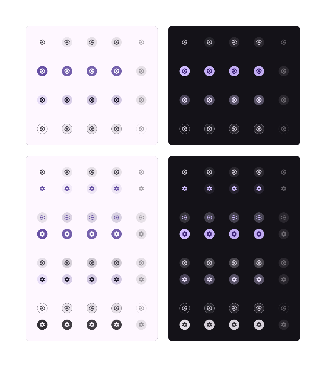
Material Design Compliance
Follows Google's Material Design guidelines with proper spacing, typography, elevation, and interaction patterns.
Touch-Optimized
Designed specifically for touch interfaces with appropriate touch targets, gestures, and haptic feedback support.
Lightweight & Efficient
Minimal memory footprint and fast rendering make it perfect for resource-constrained embedded systems.
Customizable Themes
Easy theming with Material Theme builder support, allowing you to match your brand colors and design preferences.
Material Design Customization
Tailor the Material Design theme effortlessly to match your brand's identity and requirements, making your app distinct and professional.
Flexible Component Layouts
Explore various layout options with responsive grids, flexible containers, and adaptive components that work across all screen sizes.
Cross-Platform Responsiveness
Ensure your app's optimal performance on various devices and screen sizes, providing a consistent and enjoyable user experience.
Rich Media Support
Seamlessly incorporate images, icons, and multimedia elements that enhance your content and engage users effectively.
Enhanced User Experience
Captivate your users with intuitive navigation, smooth animations, and visually appealing interfaces that encourage engagement.
Continuous Updates
Stay aligned with the latest Material Design specifications through regular updates and new component additions.
Rapid Development
Skip the time-consuming process of building UI components from scratch and launch your Slint application sooner with Material UI.
Community Support
Join the growing Slint community for insights, resources, and assistance, ensuring you're never alone on your development journey.
Get your Slint application up and running in no time with Material UI.
Step 1: Install Slint
Install Slint and the VS Code extension for the best development experience.
Step 2: Add Material UI
Include Material UI components in your Slint project and start building your interface.
Step 3: Customize Theme
Use the Material Theme builder to customize colors, typography, and component styles.
Ready!
Components
Core Material UI Components
Essential components for building modern Slint applications with Material Design
Top-level navigation components with actions, titles, and search functionality for your app's main interface.
Multiple button variants including filled, outlined, and tonal styles for different interaction contexts.
Content containers with elevation and various layouts for displaying information in organized, visually appealing ways.
Modal interfaces for important actions, confirmations, and detailed information that require user attention.
Drawers, navigation rails, and bottom navigation bars for seamless app navigation and structure.
Text fields, checkboxes, switches, and other input components for user data collection.
Loading spinners and progress bars to provide feedback during operations and data loading.
Brief notifications that appear at the bottom of the screen to provide feedback and confirm actions.
Contextual help and information that appears when users hover or focus on interface elements.
FAQs
Frequently Asked Questions
Learn more about Slint Material UI components and how they can enhance your application development.
What platforms does Slint Material UI support?
Slint Material UI works across desktop (Windows, macOS, Linux), mobile (iOS, Android), and embedded platforms, providing consistent Material Design components everywhere.
How do I integrate Material UI into my Slint project?
Simply include the Material UI components in your Slint project, import the components you need, and start building your interface with Material Design principles.
Can I customize the Material Design theme?
Yes! Slint Material UI is fully compatible with Material Theme builder, allowing you to customize colors, typography, and component styles to match your brand.
Slint +
Material UI
Start building beautiful, professional applications today with Material Design components for Slint.